237
237
New dashboards
New on all dashboards (except applicant summary):
Descriptions have been added to all dashboards that explain what is being shown to aid understanding.
Records widgets have been added to the top corners of dashboards, to show the number of applications or jobs being shown, at that time, on the dashboard and is dependent on the filters selected.
On dashboards with date filters – the filter will be set to the last 90 days as default. The filter will have additional options for:
-
today
-
this month
-
last 7 days
-
last 30 days
-
last 60 days
-
last 90 days
-
last 180 days
-
last 365 days
-
this year and
-
previous year.
Please note there is a slight difference in the date ranges used in the old dashboards compared to these dashboards. These dashboards include today’s date in the range.
For example the last 90 days on these dashboards starts with today’s date and includes the past 89 days. (On your previous dashboard version, it included today’s date in addition to the last 90 days.)
Downloading reports:
The entire dashboard can be downloaded and saved as a PNG or a PDF by clicking the export button at the bottom of the dashboard. Alternatively, the tables can be exported into Excel or saved as PNG images. The download icon on the tables will appear in the top right corner of tables when hovered over.
Job summary:
This report gives you a general overview of your job activity. The data on this dashboard is refreshed every hour.
New to the report:
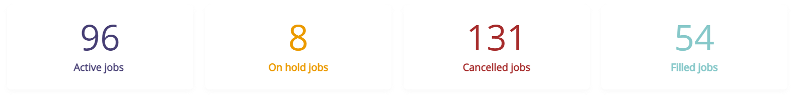
The jobs widget in the top right corner shows the total number of jobs on any status (including draft jobs). There is a tool tip over this widget explaining this.
The four KPI widgets show the number of: Active | On hold | Cancelled jobs | Filled jobs
and is dependent on the filters. This gives recruiters a quick snapshot of their key job activity.
Job breakdown:
This report provides you with data around the different status’s that applicants have been updated to.
This dashboard is updated every hour to pull fresh data.
New to the dashboard:
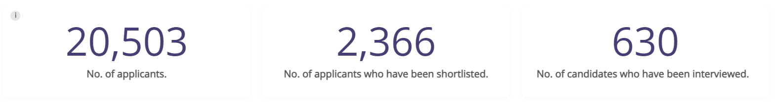
The jobs widget in the top right corner shows the total number of jobs created during the time period on the report. The top row of the KPI widgets shows the total number of applicants along with the total number who have ever been on a shortlist status or an interview status.
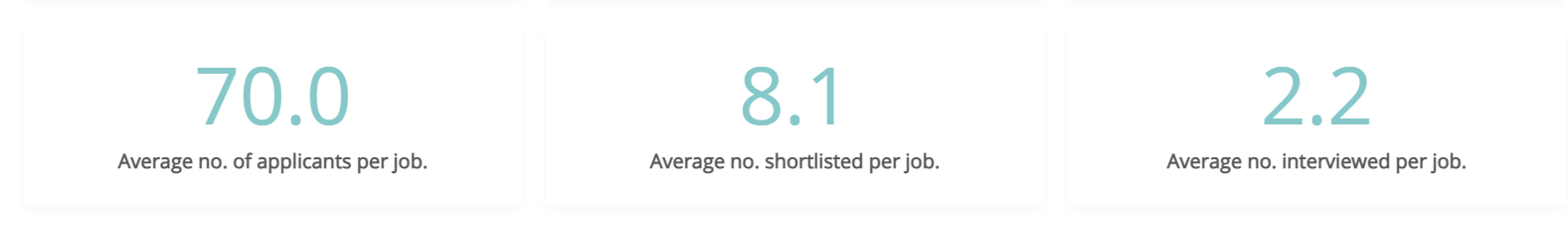
The bottom row of KPI widgets show the average no of applicants per job, and the average number of applicants who were shortlisted or interviewed per job.
The table shows the total number of completed applications, and the total number of candidates who have ever been on a shortlist, interview, offer, hired, rejected or rejected after interview status. There is also an additional field to show the total number of applicants who have applied and not been processed off the applied status.

Applicant source:
This report allows you to view the origin(source) of all applicants in your ATS.
Please note this report will only show applicants for jobs that have been marked as filled, active or cancelled.
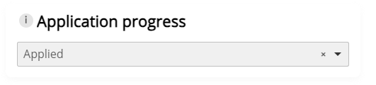
The application progress filter shows the applicants who have ever been on each status, with the default for this filter being Applied to show all the completed applications.
Interviewed shows all applicants who have ever been on an interview status.
Hired shows all applicants who have ever been on a hired status.
The data on this dashboard is refreshed every hour.
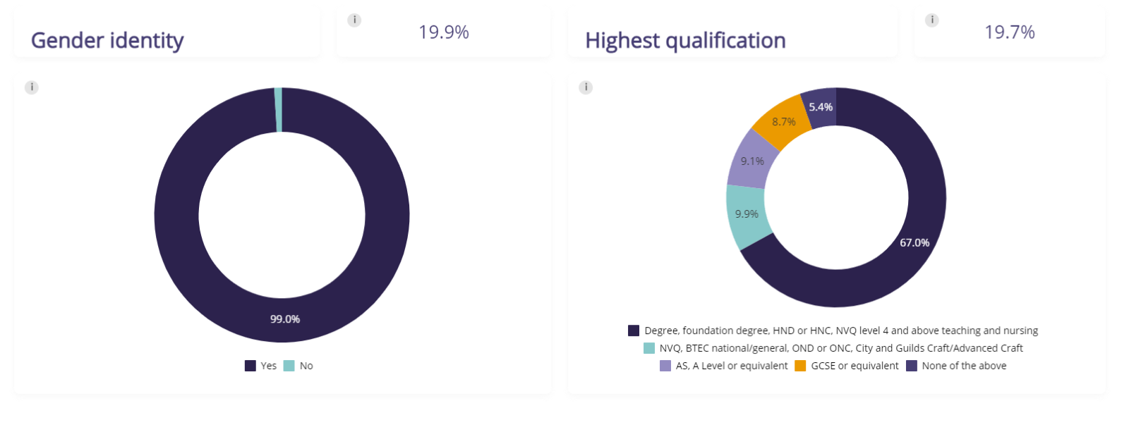
Diversity dashboard:
This report allows you to view diversity information that applicants have submitted.
The data for these dashboards are updated hourly with fresh data.
New features:
The widget in the top right corner shows the total number of applications. The widgets next to each diversity metric shows the percentage of applicants who have opted in to giving the data shown in the doughnut chart. The application status types of other and interview request have also been removed from the dashboard and filter.

-
All applicants who have not opted in to giving this data or who have answered Prefer not to say have been filtered out of these reports.
-
All percentages have been rounded up to one decimal place.
-
Gender identity match and highest academic qualification have also been added to this dashboard.
Time to hire:
Assuming you log applicants as “hired” in your ATS the below report will show you the:
-
Days to move applicant to interview – the number of days between the date the applicant applied and the date the applicant was moved to any interview status.
-
Applicant time to hire – the time from the date the candidate applied for the vacancy to the date they were changed to hired on the system.
-
Job time to hire – the time from the date the job was first published to the date the hired candidate was changed to hired on the system.
-
Days to publish from creation – the time from the date the job was created to the date the job was created.
New features:
The widget in the top right corner of the dashboard shows the total number of candidates that have been hired.
The KPI widgets show the average number of days to move the applicant to interview, the average number of days to hire the applicant from the date the candidate applied and the date the job was created.

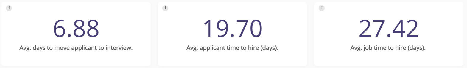
An additional KPI has been added to this table – The number of days to move applicant to interview.
The table shows the number of days to publish the job from the creation date, the candidate’s time to interview, time to hire and the job time to hire, alongside the job and candidate's details.
The job time to hire is calculated using the date the job was first published – this is based on how we collect the data in the ATS and cannot be changed to for example the latest date the job was published if the job is regularly reposted.

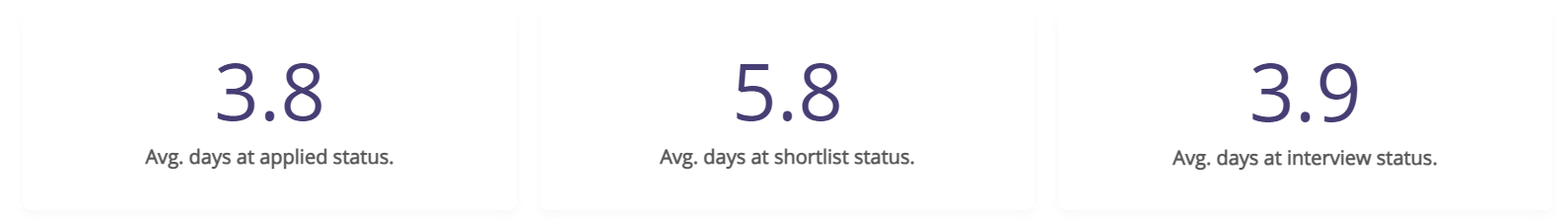
Average time to process:
This report shows you the average time (days) for applicants to be either progressed or rejected at each stage of the recruitment process. These numbers are only accurate if you log applicants shortlist, interview, and offer status. This report has all draft jobs filtered out and will not include jobs that have no applicants.
New features:
The widget in the top right corner shows the number of jobs being included in the report based on the current filters. The KPI widgets show the average number in days that applicants spend at applied, shortlist and interview stages.
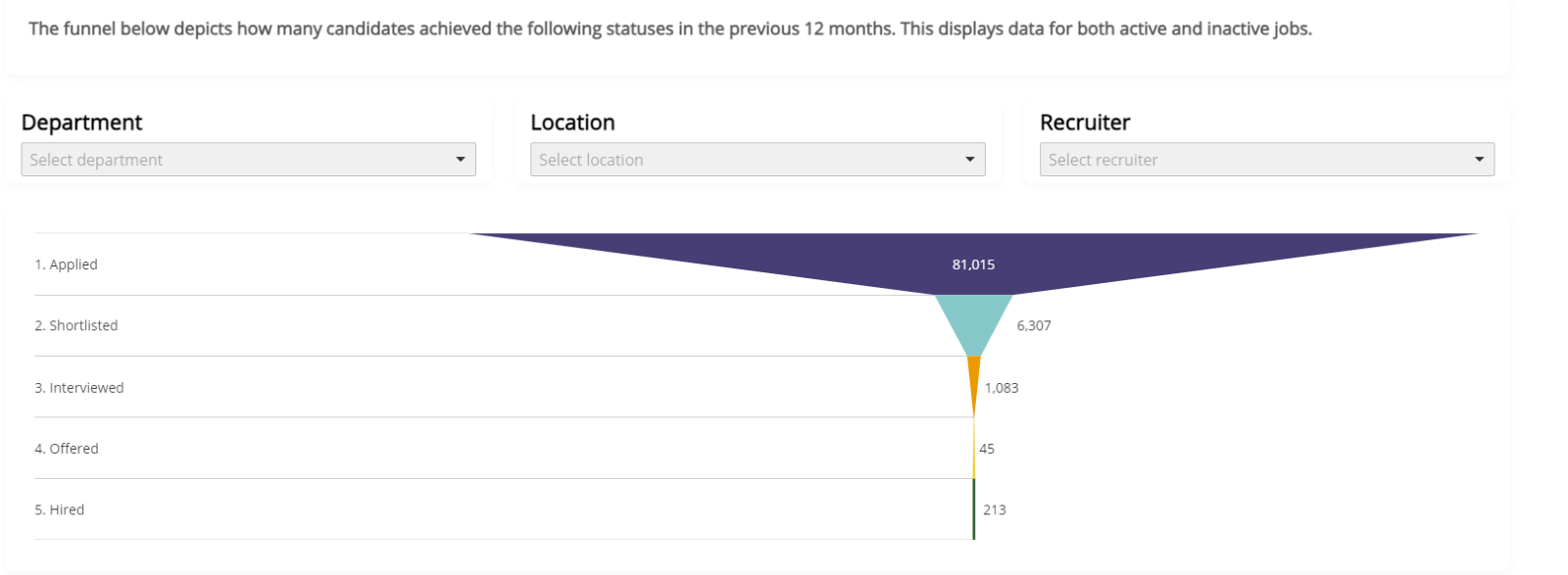
Applicant summary:
This report gives you an overview of everything that has occurred within the ATS.
There are two main parts to this dashboard, the number widgets and the funnel.
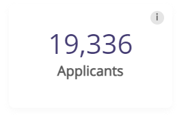
The number widgets show the number of applicants on Applied | Shortlisted | Interviewed | Offered against all active jobs in your ATS. There is no time period behind this data and it is designed to show recruiters their current workload against all active jobs. These widgets can be filtered by Job, location and recruiter. This is designed to show your current workload against all active jobs.
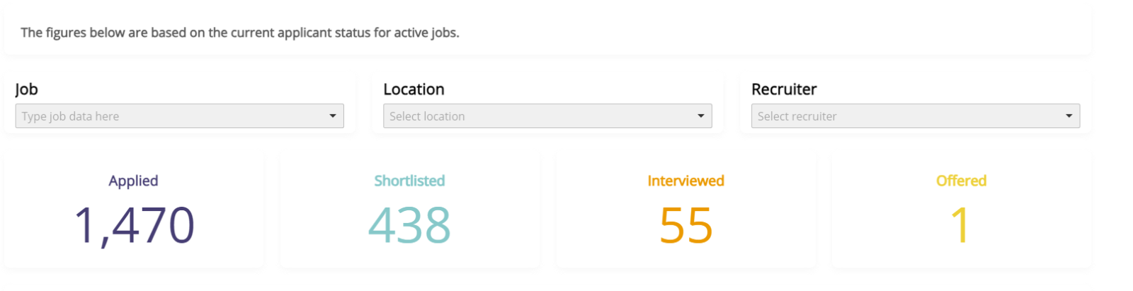
The funnel shows the total number of candidates who have been on each status type over the past 12 months and is counting against all jobs whether they are active or not. It’s filterable by department, location and recruiter. The data on this dashboard is live.